
The Art
of Time
An international luxury publication. 18 issues. 128 pages each. Three years directing the visual identity of a magazine where the standard was set by Patek Philippe, Chopard and Hermès.
Buenos Aires and Madrid. Distributed across six countries simultaneously. Every page had to justify its place in the issue.
Where desire
becomes culture
The Watch Gallery built a cultural universe around watches and jewellery for the Spanish-speaking world — a space where fine watchmaking and high jewellery coexisted with the history of art, photography, music, science and the geniuses who changed the way the world understands time and art.
It was an editorial undertaking without precedent in that market: a publication that treated its readers as connoisseurs who already understood the technical language of watchmaking and jewellery — readers who wanted that expertise placed in a wider cultural and historical context.
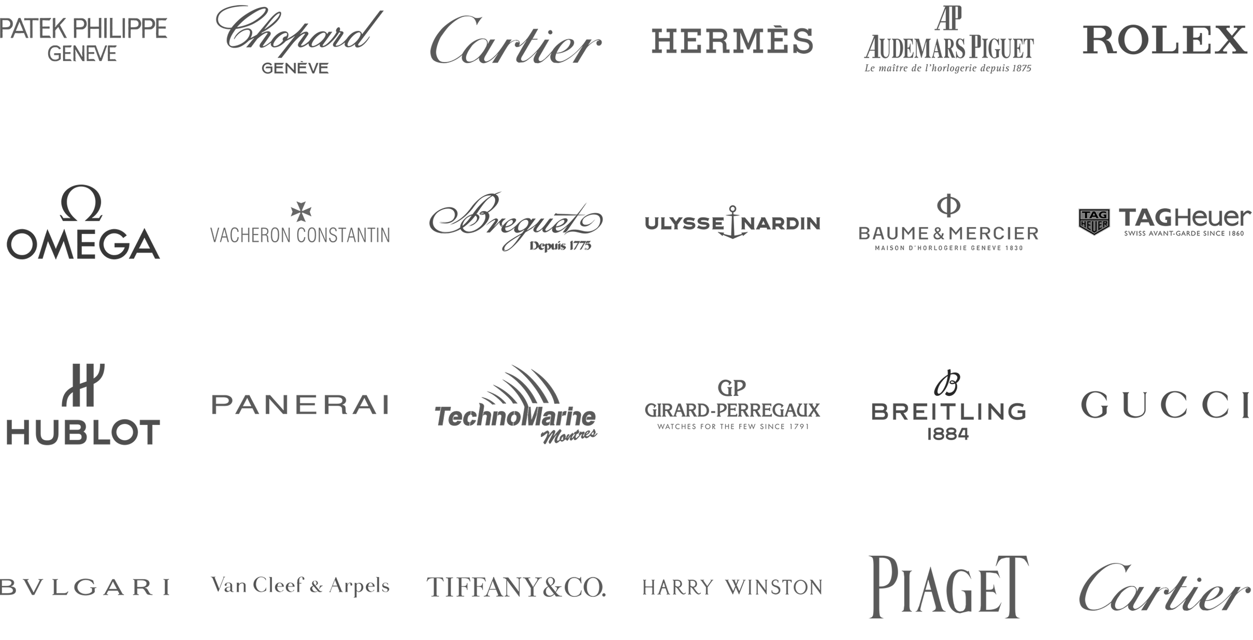
That level of editorial ambition had a direct consequence on the art direction: the advertisers funding the project included, among many others, Patek Philippe, Chopard, Cartier, Hermès, Audemars Piguet, Bulgari and Rolex — brands that demand a precise visual context.
The magazine had to match their level, page by page, issue by issue — in coherence with its own ambition.


Spread selection
Premier content
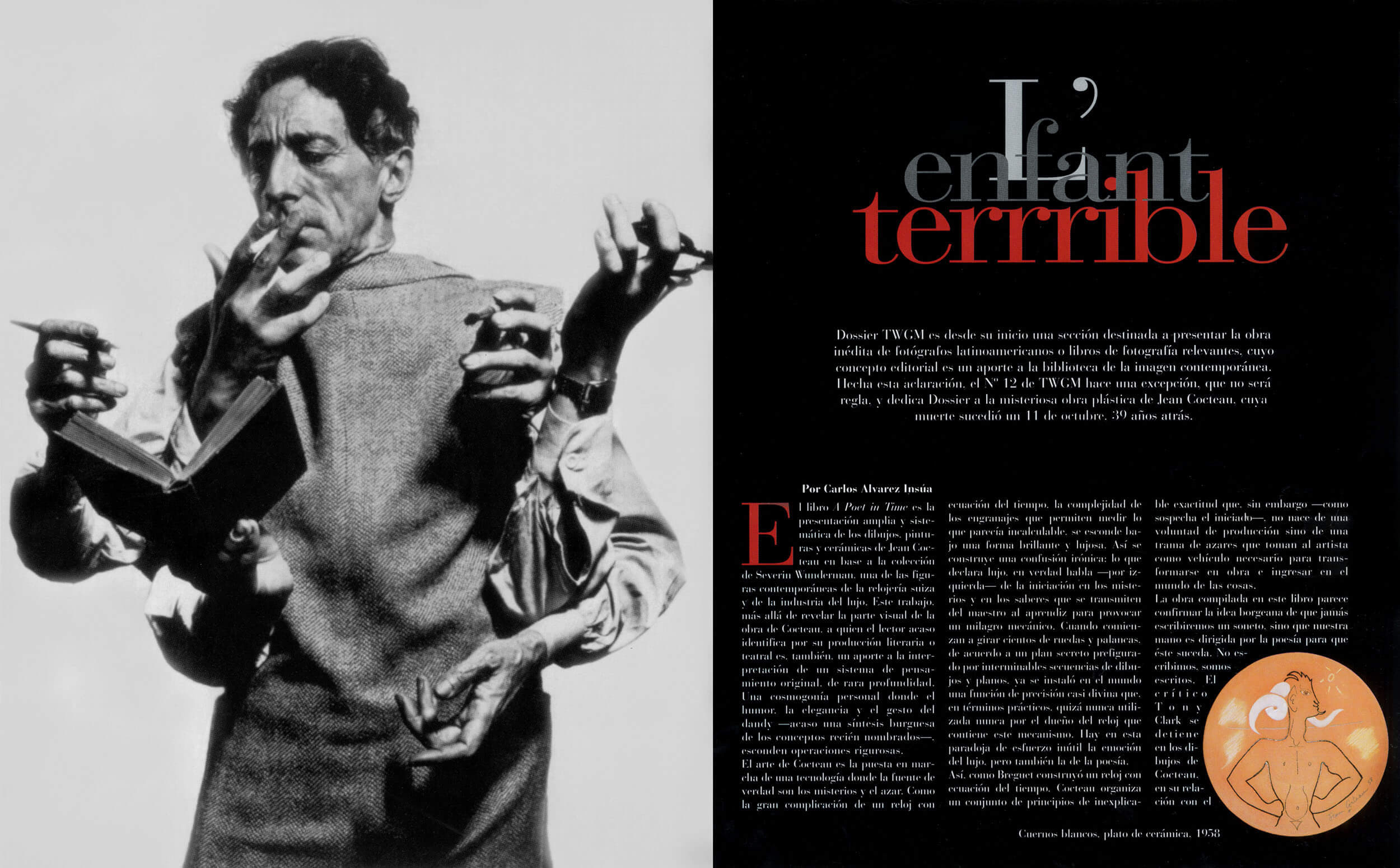
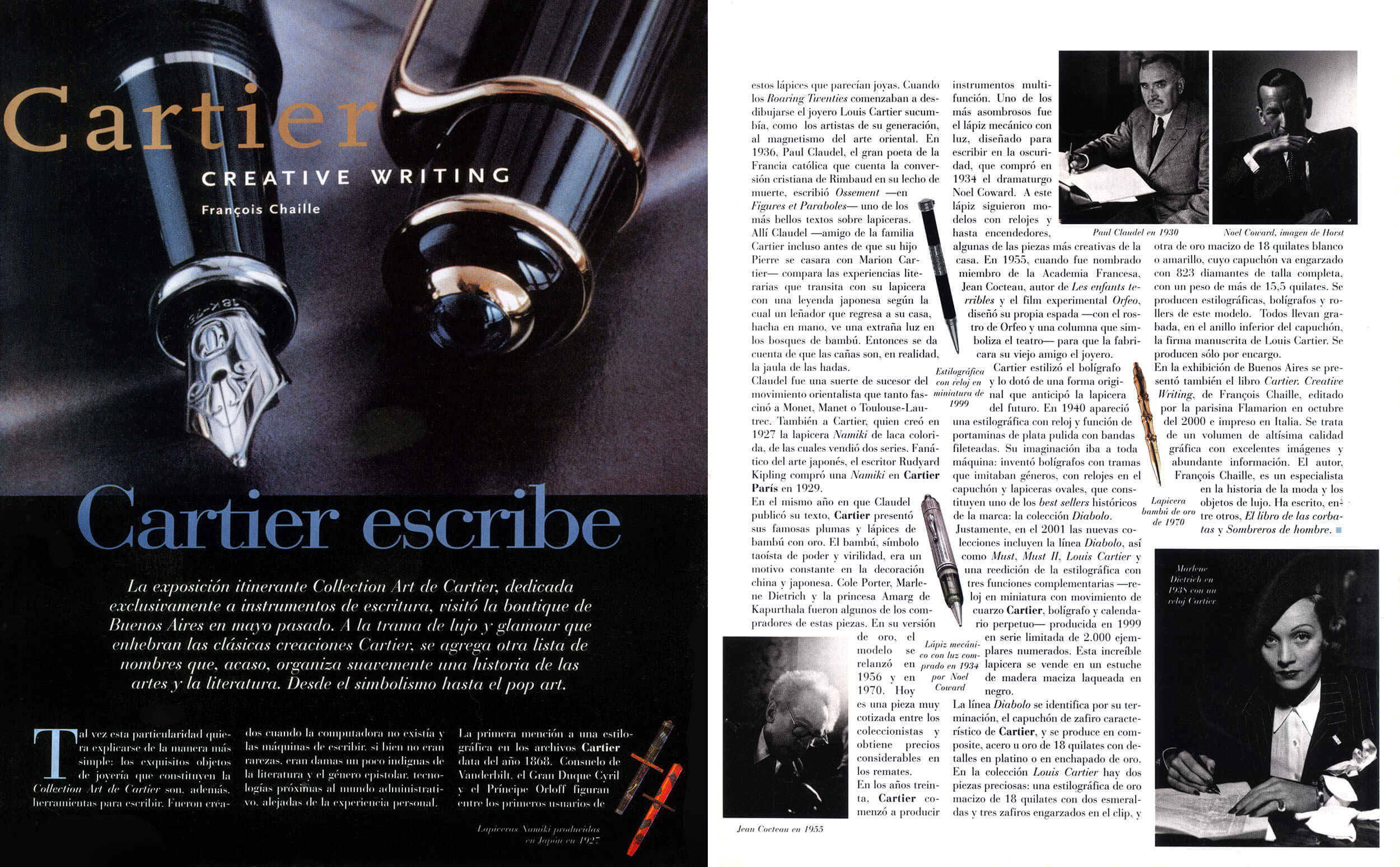
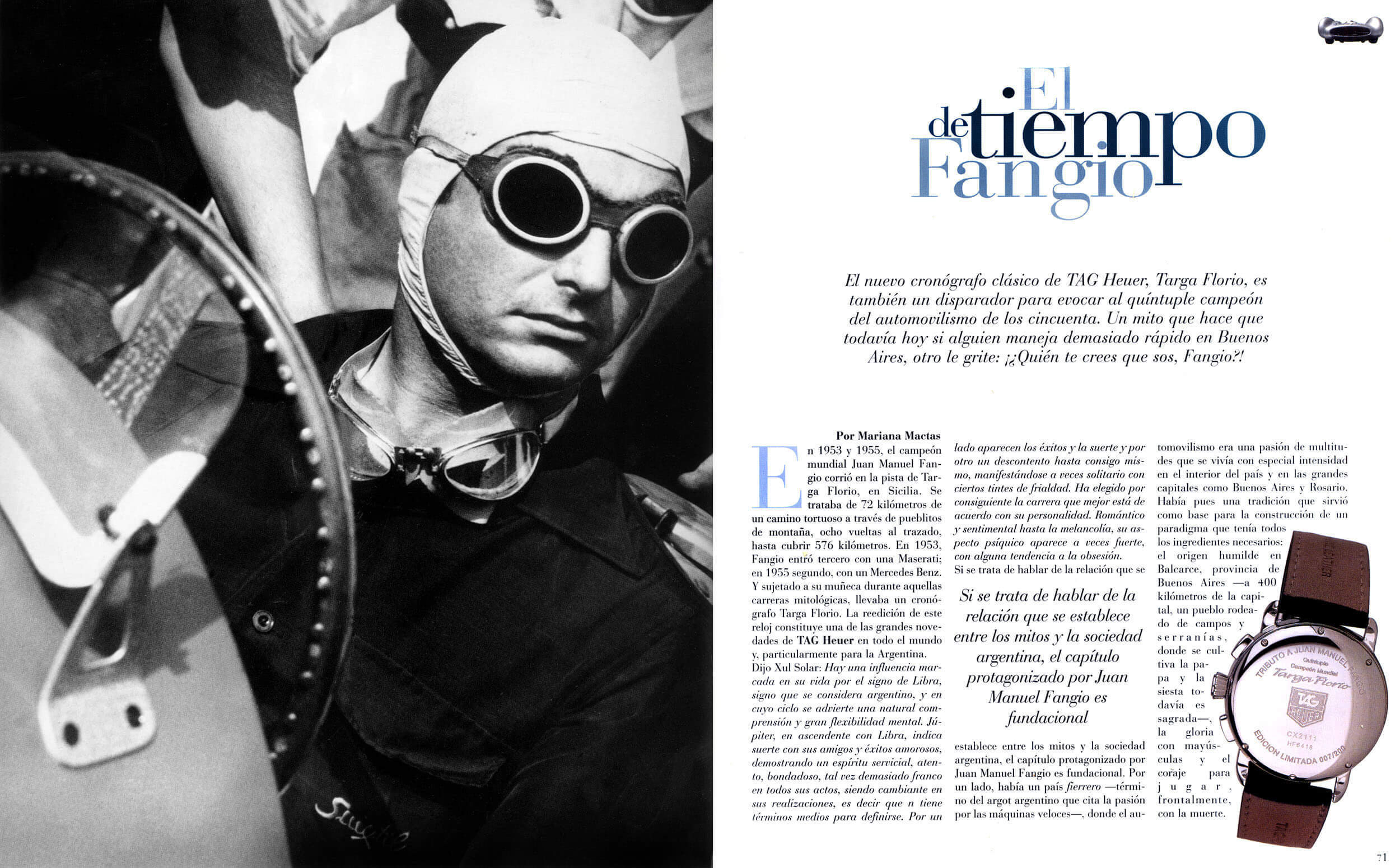
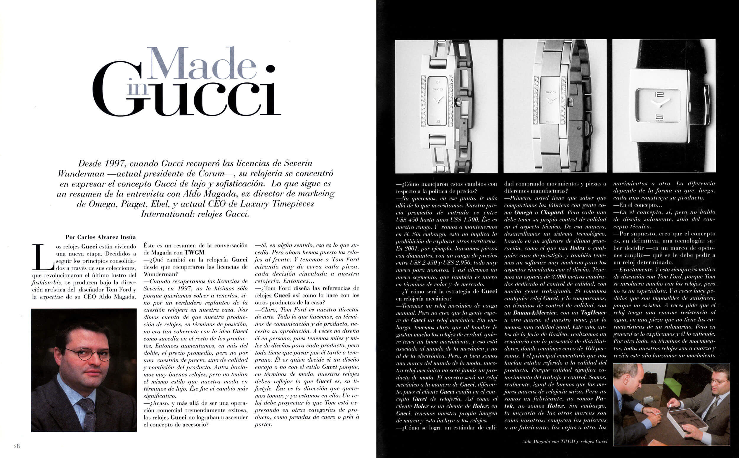
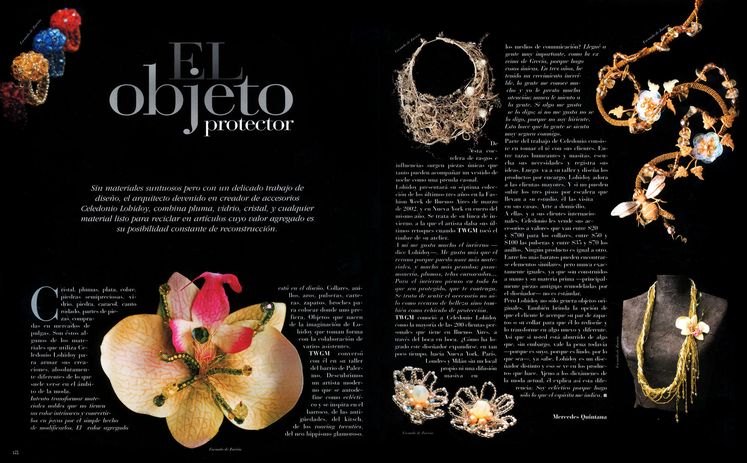
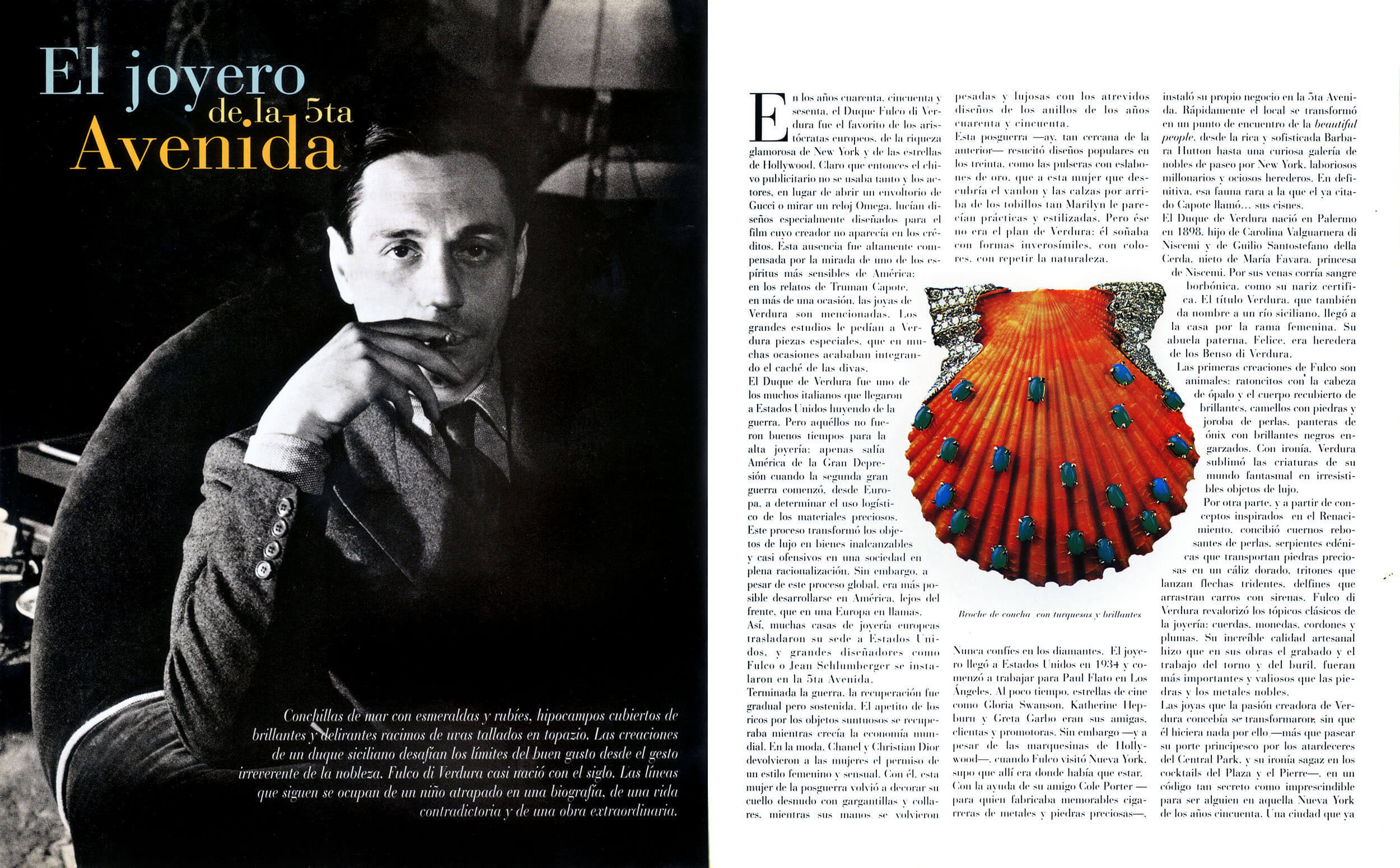
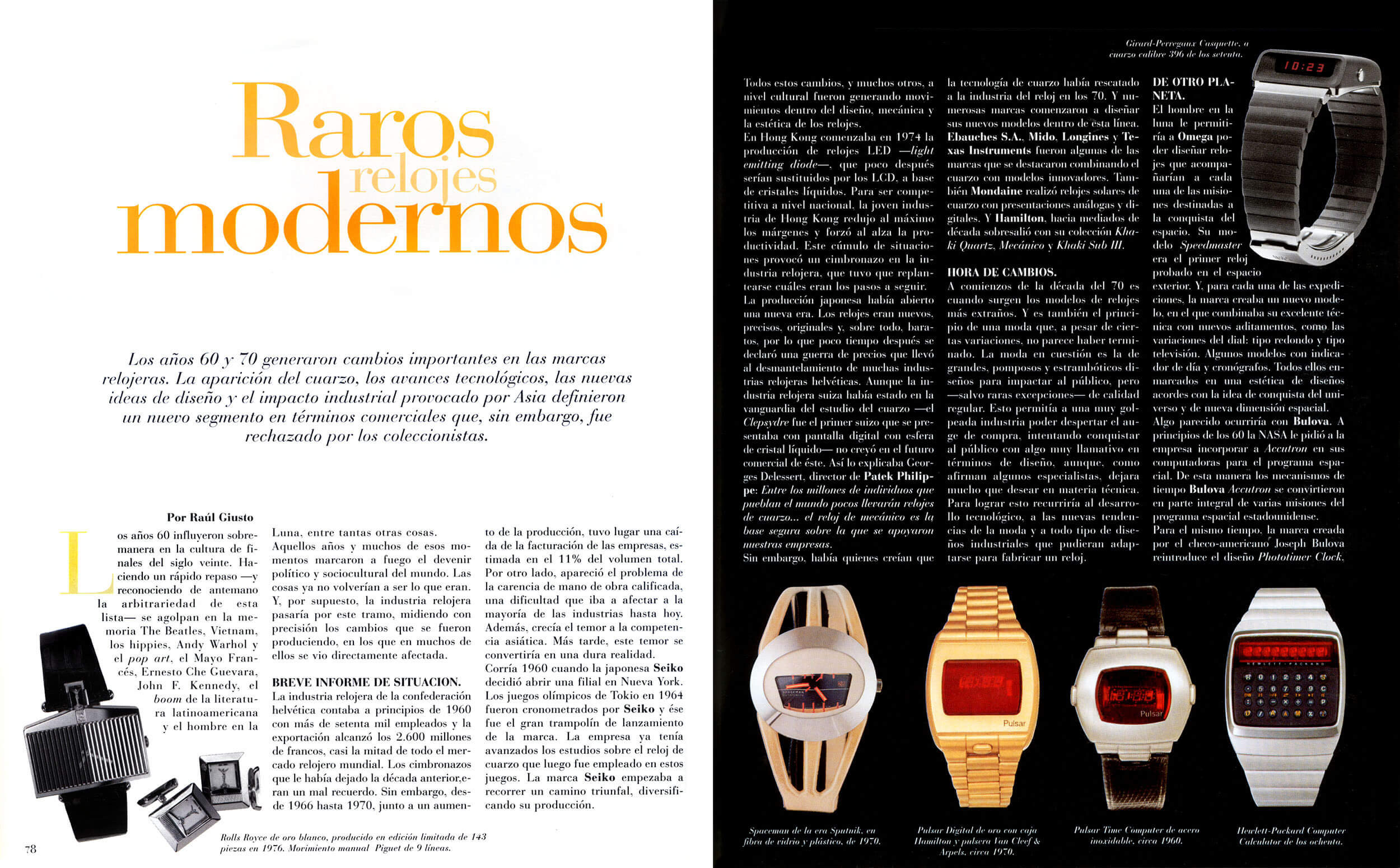
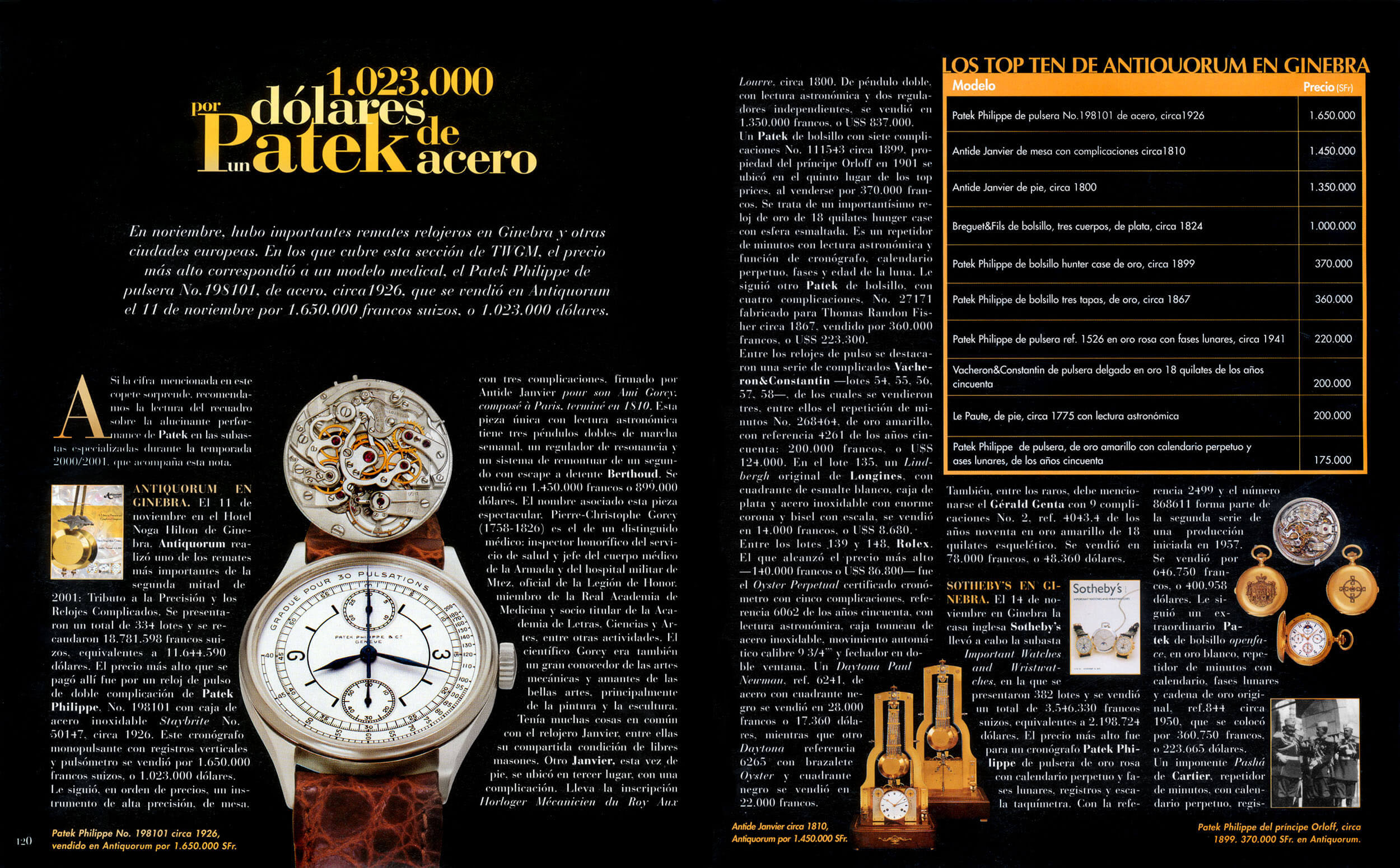
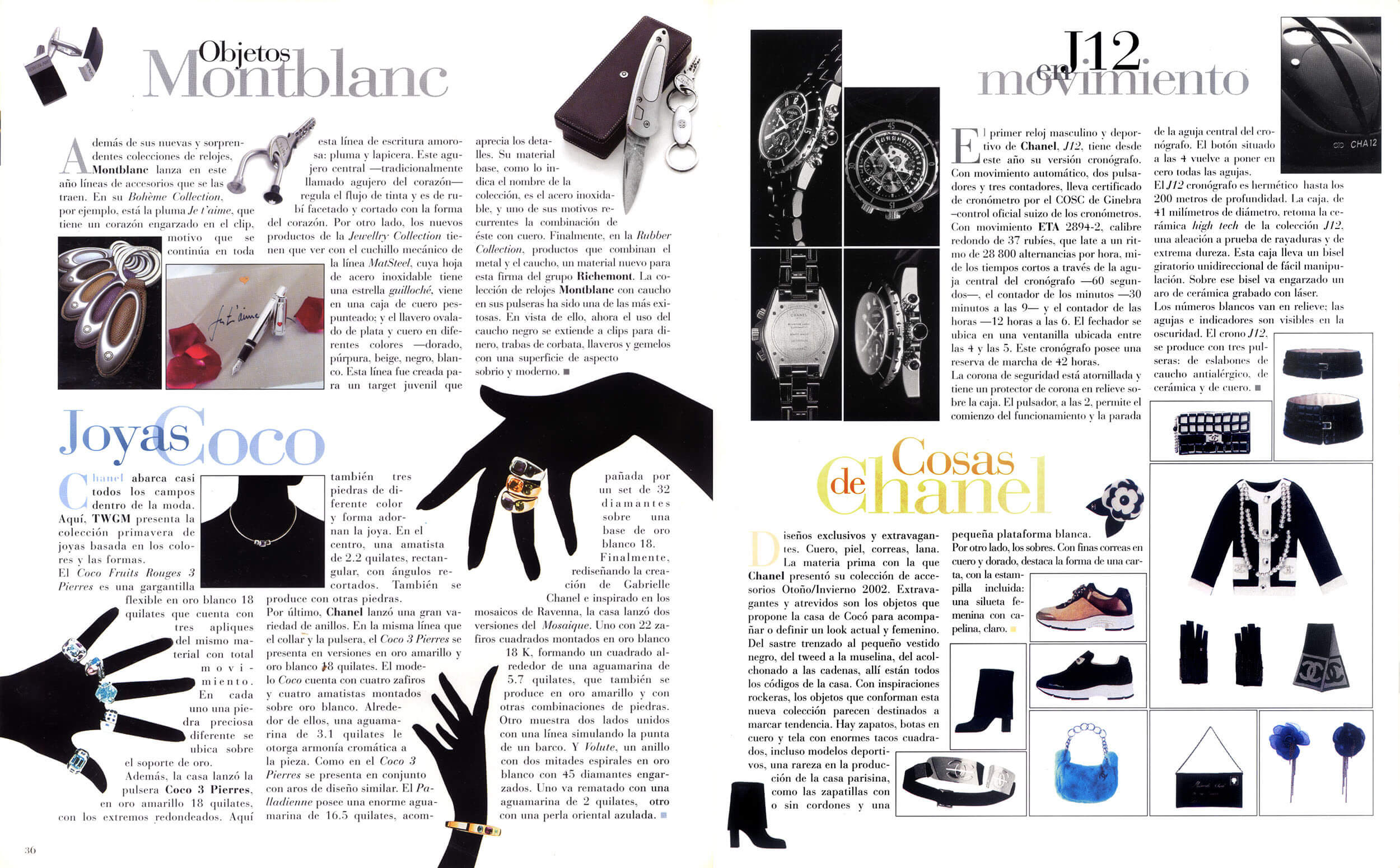
What follows is a selection of pages published across the magazine's run.






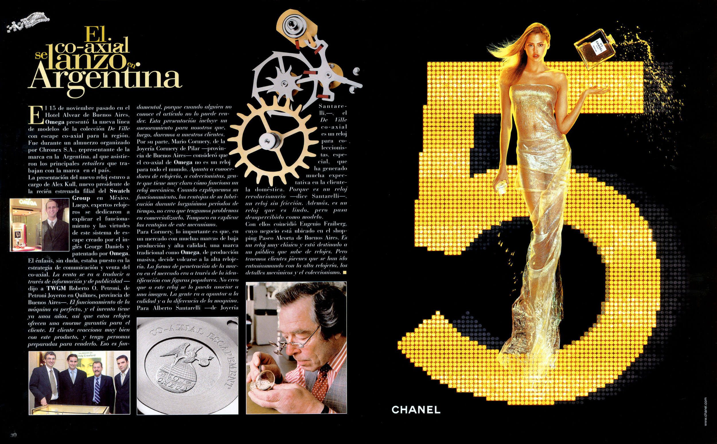
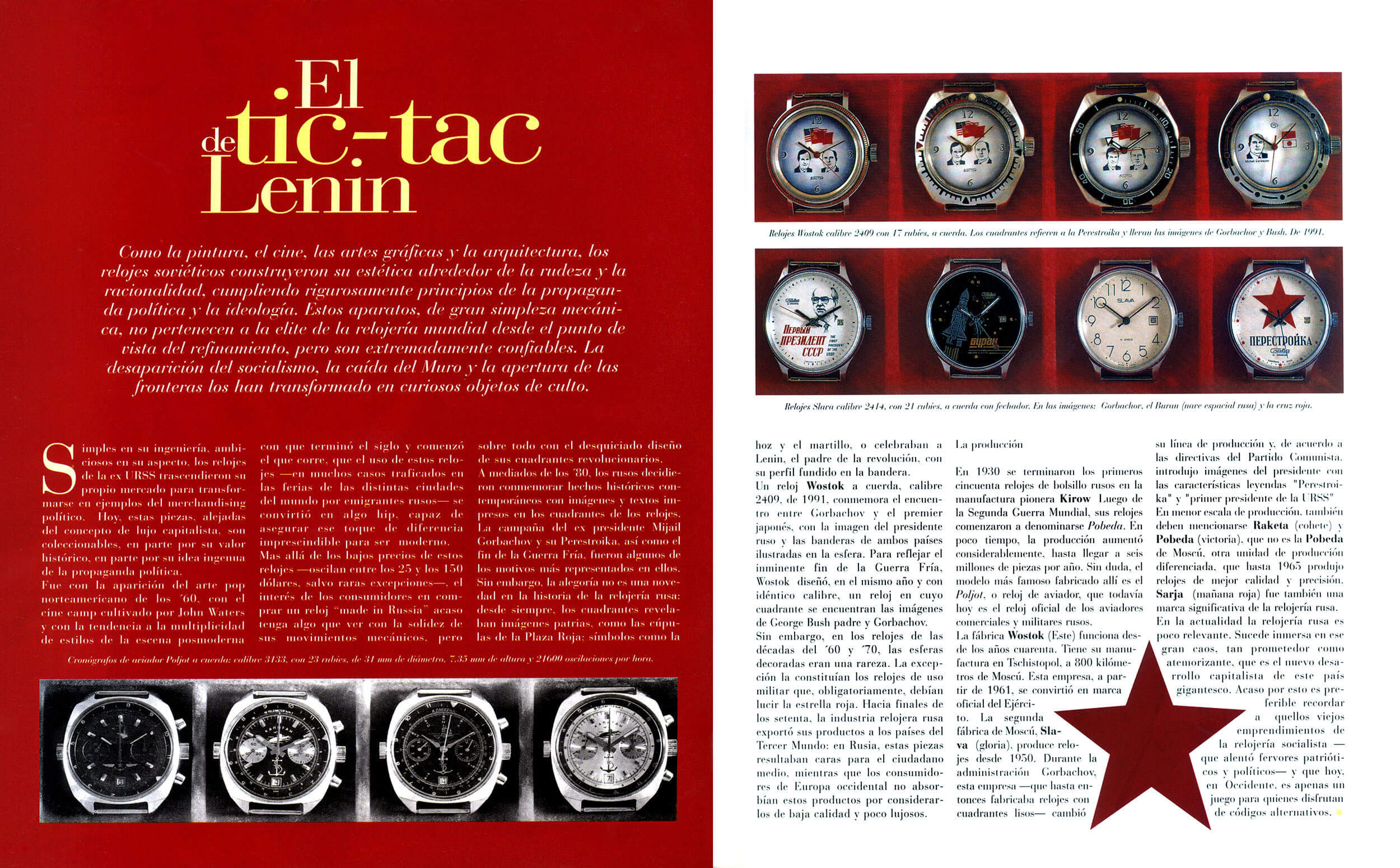
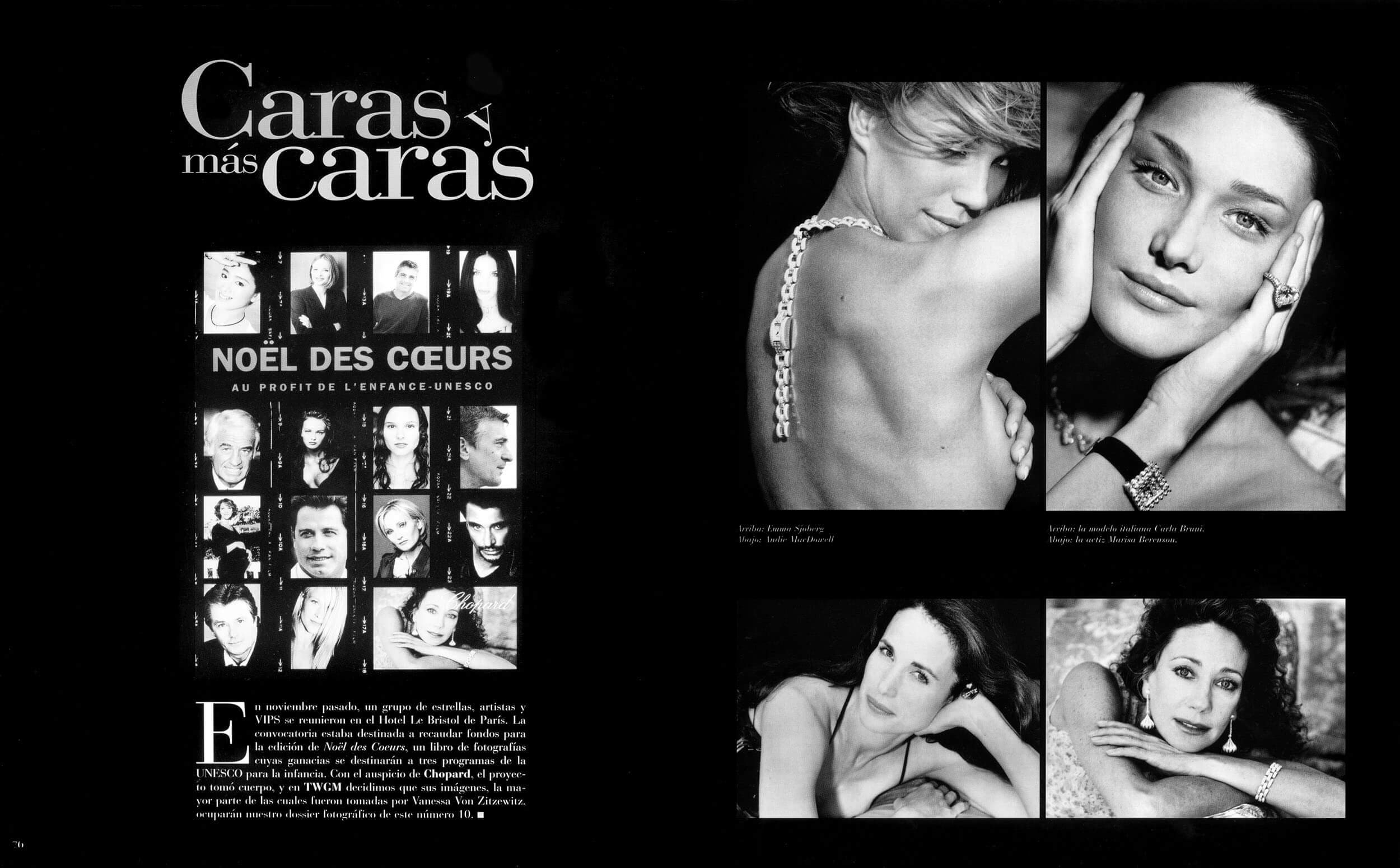
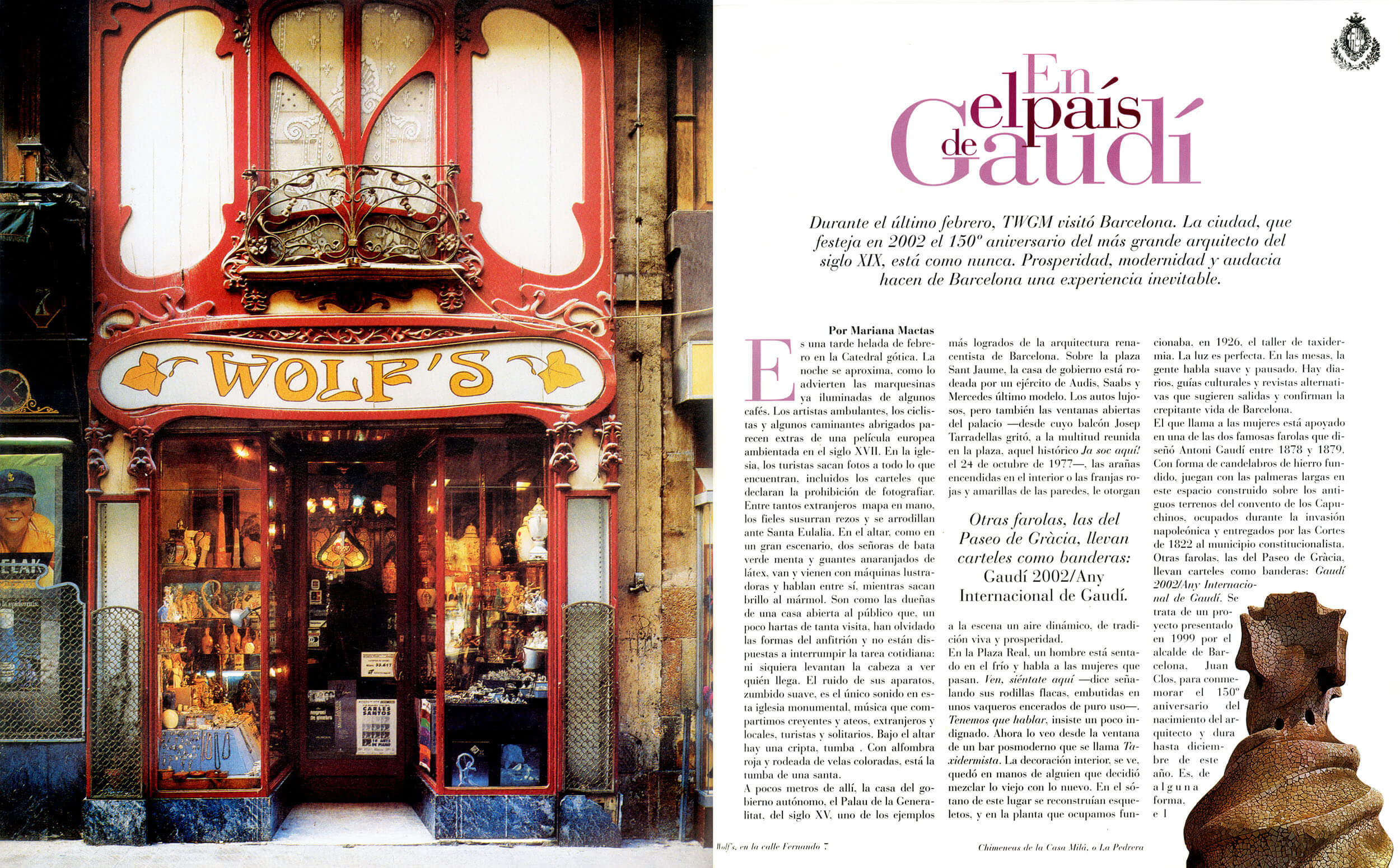


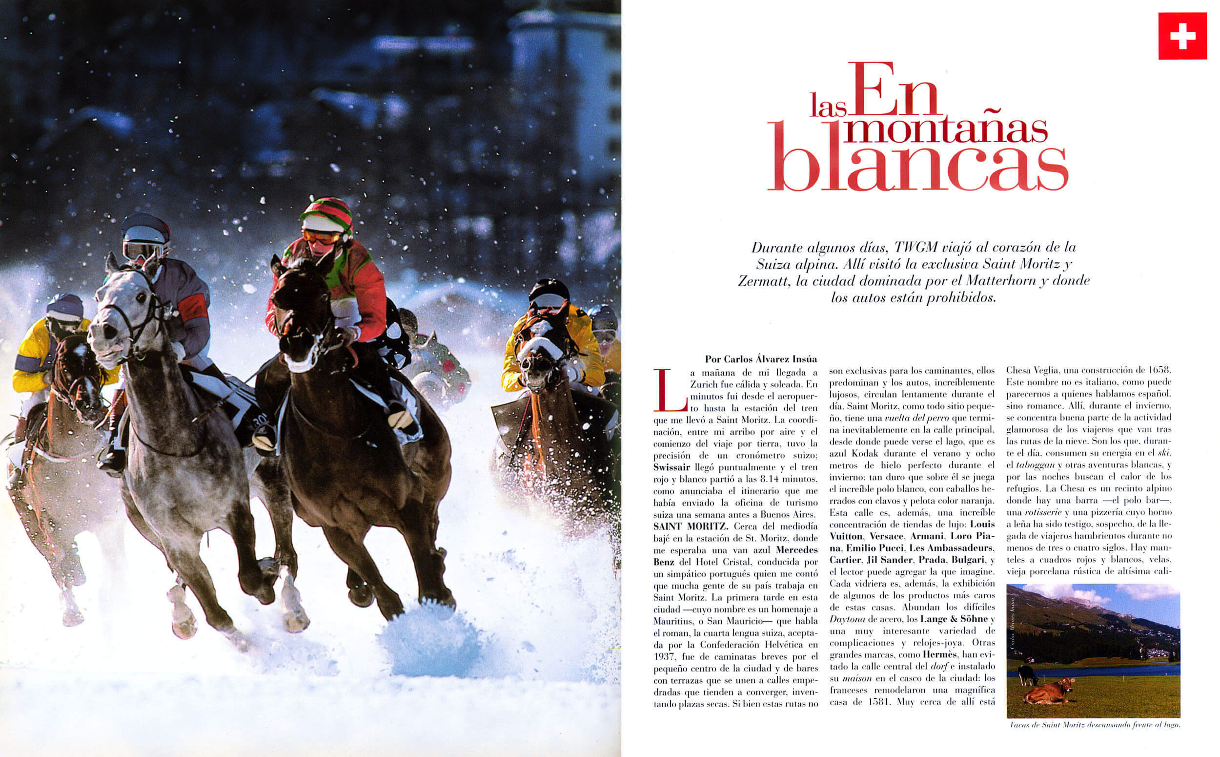
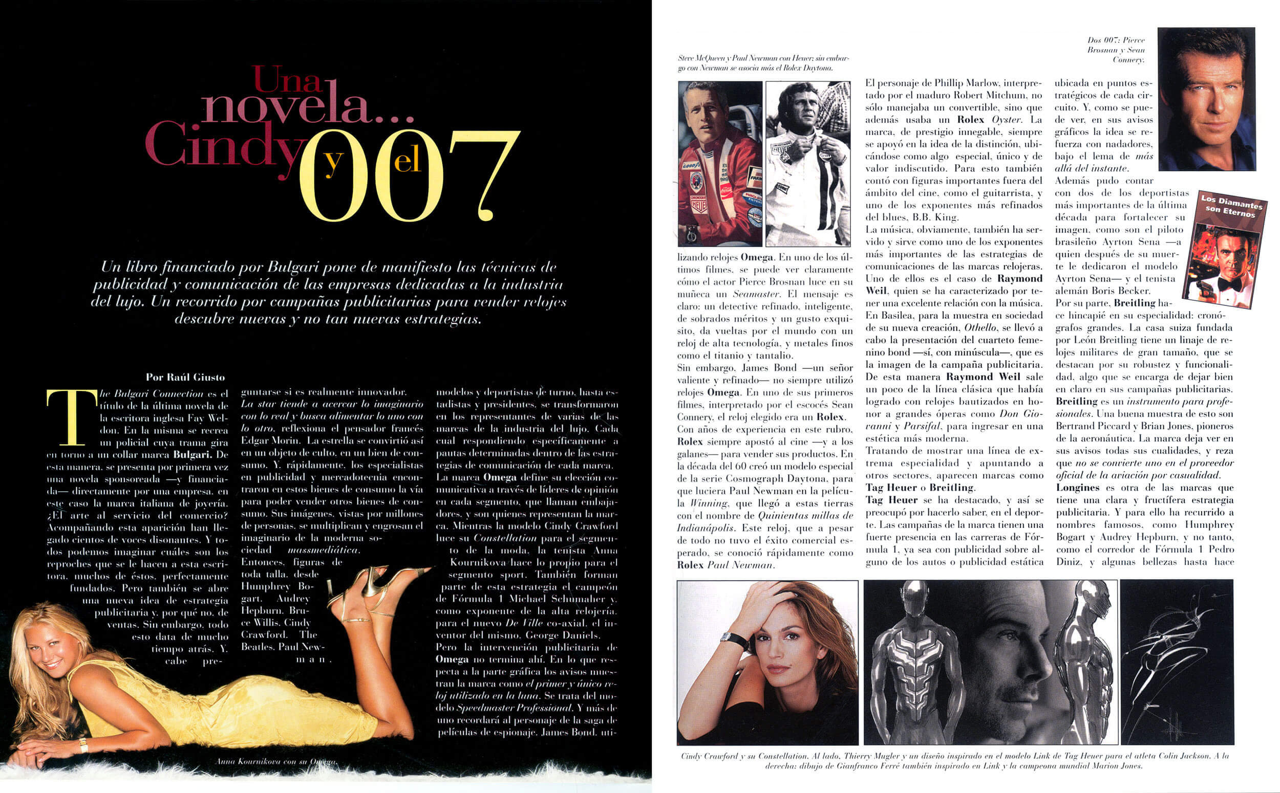
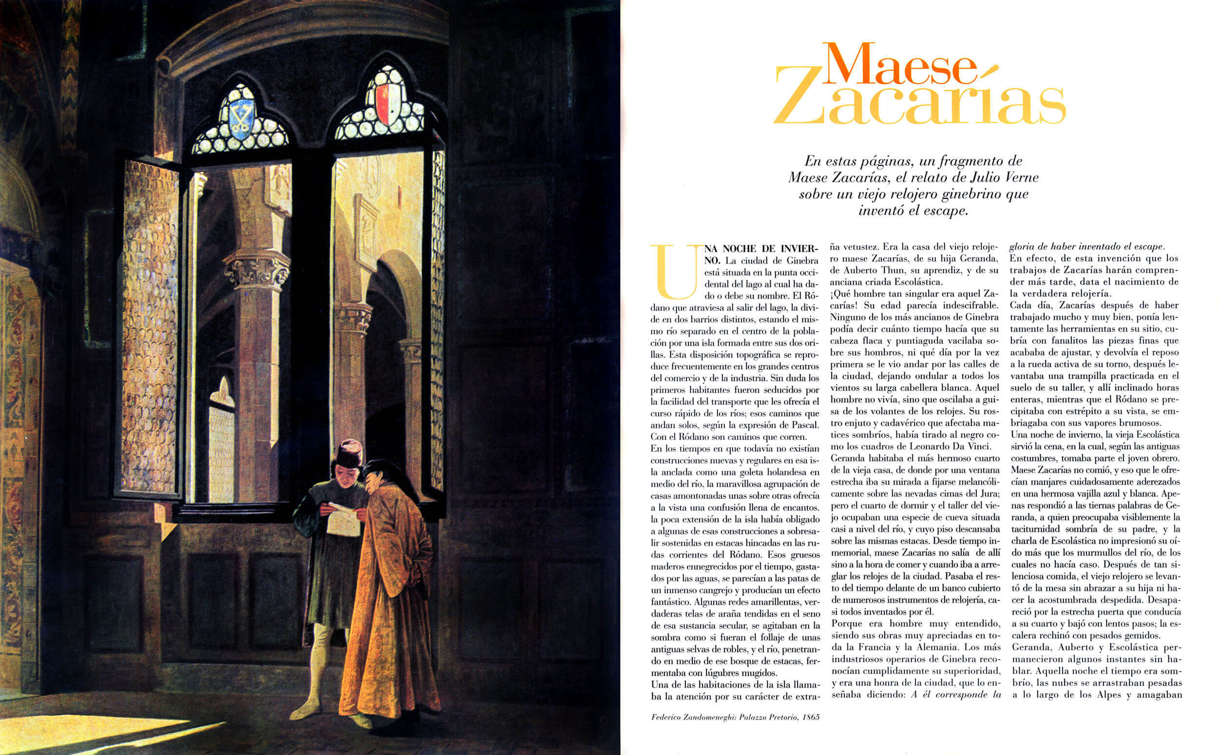
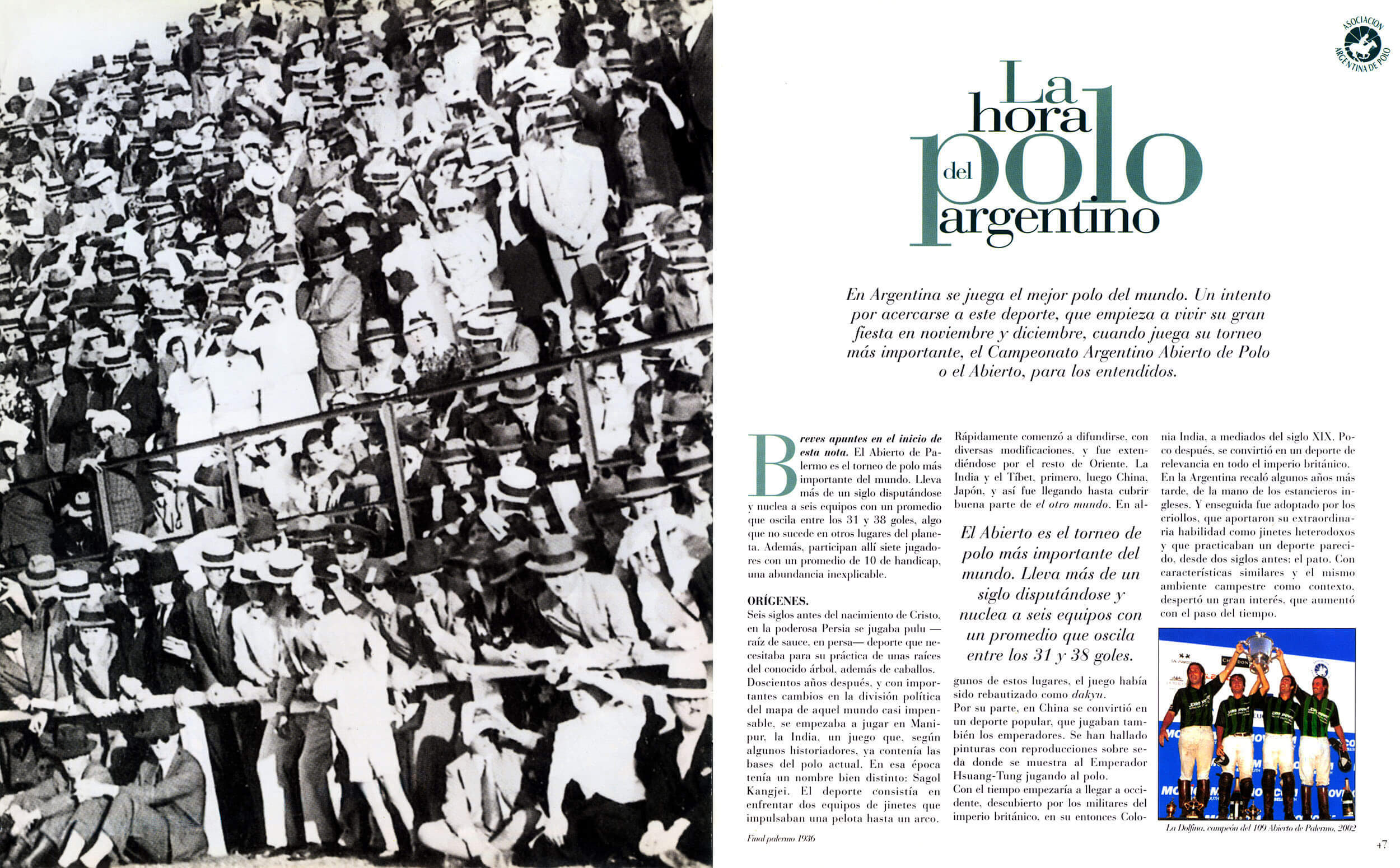





The brands
The standard
Luxury brands guard their image with the same precision they bring to their product. A publication that hosts them both as advertisers and as editorial content means operating at the same level as their own design departments.




A visual
challenge
Three years of sustained art direction: a working system built under real pressure.
Visual consistency over time
The rhythm of the sections and the visual hierarchy have to hold with coherence. Editorial discipline applied issue by issue over three years. Reconsidered and reaffirmed each time.
Range of register within a single system
Pages breathe differently according to their content — a historical dossier, a news section, a brand profile, a fair catalog — while always maintaining the identity of the publication.
Exigence imposed by context
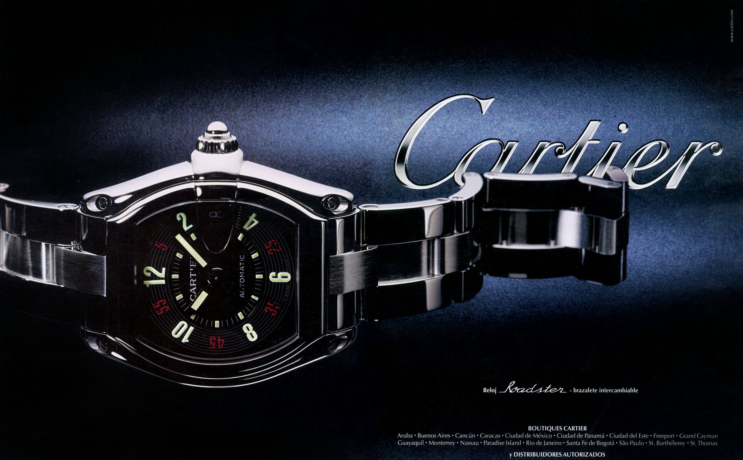
Advertiser and subject were often the same brand on the same page. The art direction had to satisfy both roles at once.
Real international distribution
Six countries, one edition. Readers everywhere from Spain to Argentina knew these brands well enough to notice if the art direction fell short.